Conversation


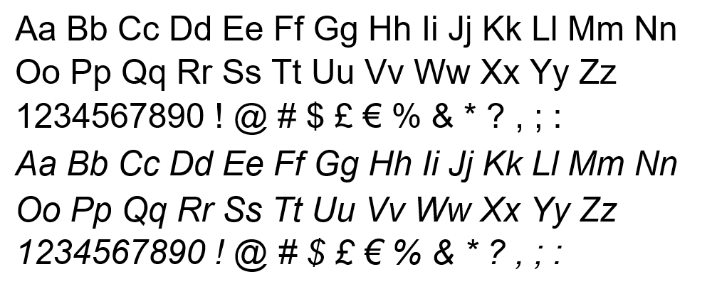
Arial is such an ugly fucking font. Why does m*crosoft not only ship it with their operating system but also has the gall to set it as the default in ms word?
 1
1
 0
0
 0
0
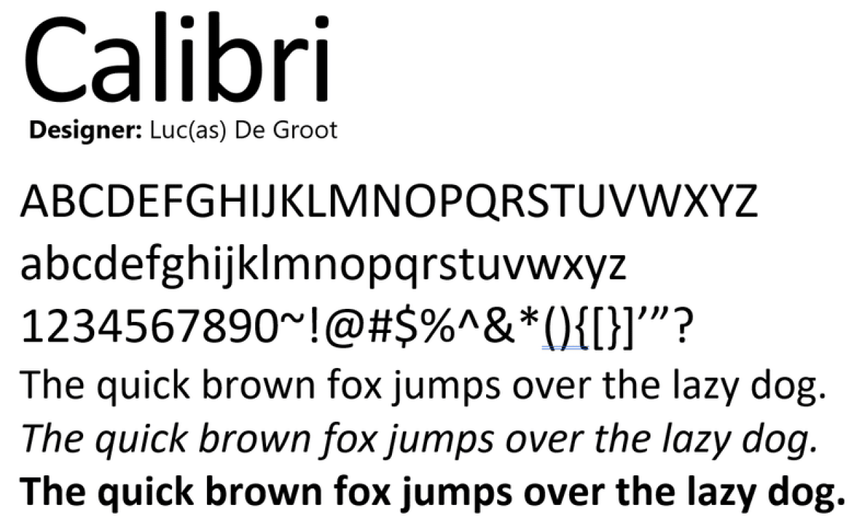
@georgia I've always hated it. Calibri as well. Any font where the lowercase 'l' and Uppercase 'I' are completely indistinguishable (I suppose the 'I' is a fraction of a pixel thicker, but most monitors can't even represent it, even at a large size).
What's worse is that I started noticing it everywhere shortly after word 2007 shipped. Calibri specifically has this disgusting rounding on all the characters that makes it really easy to spot
 2
0
1
2
0
1
Ace Ice
Ace66062@shortstacksran.ch
0
0
0
Sapphire Star
sapphire@shortstacksran.ch
0
0
0